tutorial · 2026-04-01
Adding Particle Flair to HUD Icons and Buttons in UE5
Turn flat HUD icons into glowing particle flourishes for button presses, notifications and save confirmations — without authoring Niagara from scratch.
When UI deserves particle flair (and when it doesn't)
A flat HUD does its job, but it rarely feels alive. The moment a player taps a button, confirms a save, or earns a notification, a tiny burst of motion sells the interaction far better than a static state change ever can. If you have been searching for a UE5 UI HUD button press notification particle effect, the honest answer is that you do not need to author bespoke Niagara for every glyph — you need a library of icon-shaped effects you can drop in and tune.
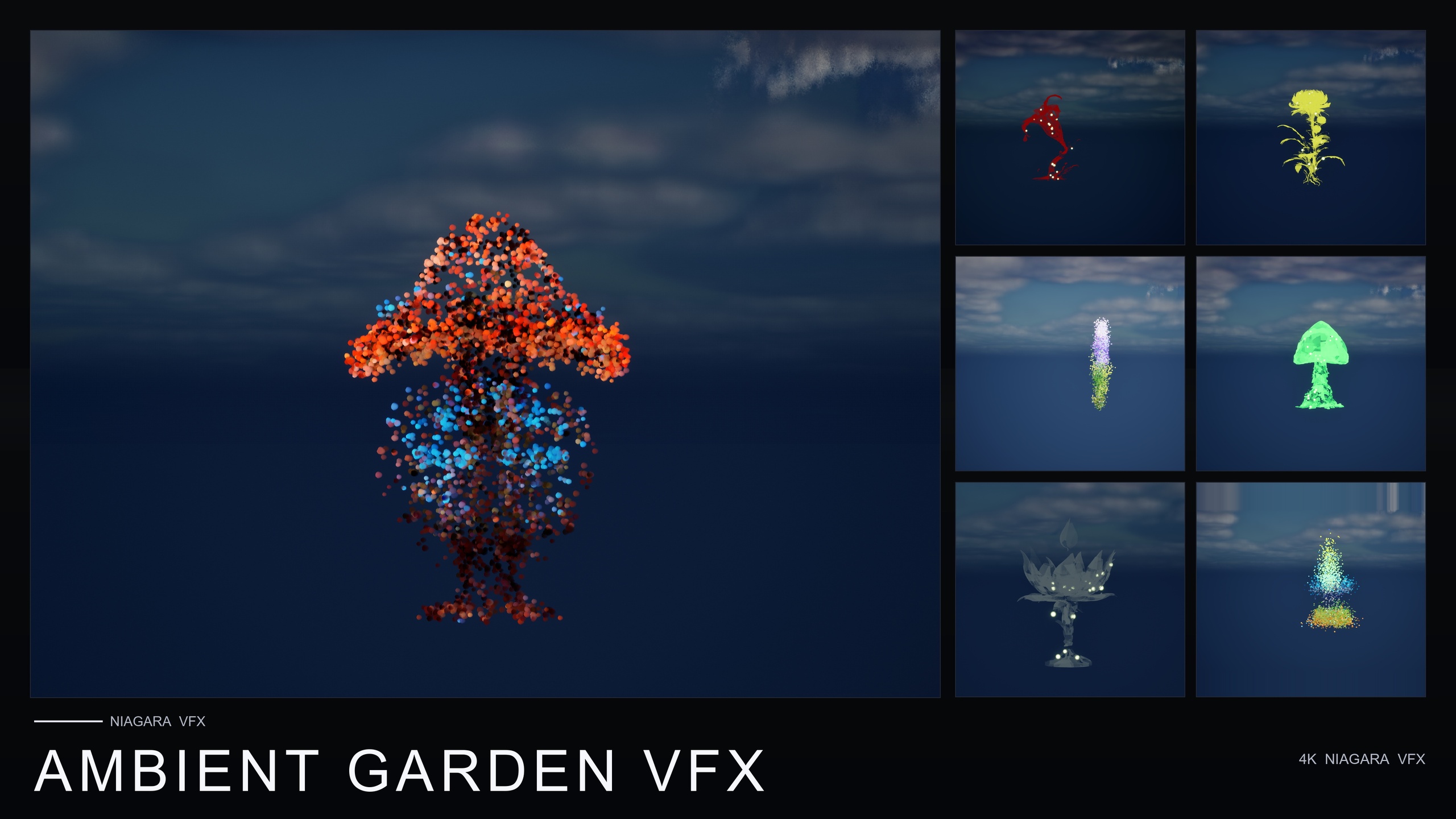
That is exactly what the Material Design Icons pack inside the Emojis and Icons VFX Bundle provides: 29 effects built from the familiar Material Design vocabulary — home, menu, search, favorite, add, settings, camera and a set of arrows — drawn entirely out of particles rather than a flat sprite. Each one is a Niagara CPU sprite renderer that samples particle positions across a baked 3D glyph mesh, so the icon is literally assembled from glowing points.
Before you sprinkle particles everywhere, be deliberate. Flair earns its place on moments that matter: the primary call-to-action, a save or purchase confirmation, an achievement pop, an onboarding pointer that needs the eye. It does not belong on every list row, every hover, or behind dense text you need to read. The packaged Material icons make it cheap to add a flourish anywhere, which is precisely why restraint is the skill that separates a polished HUD from a noisy one.
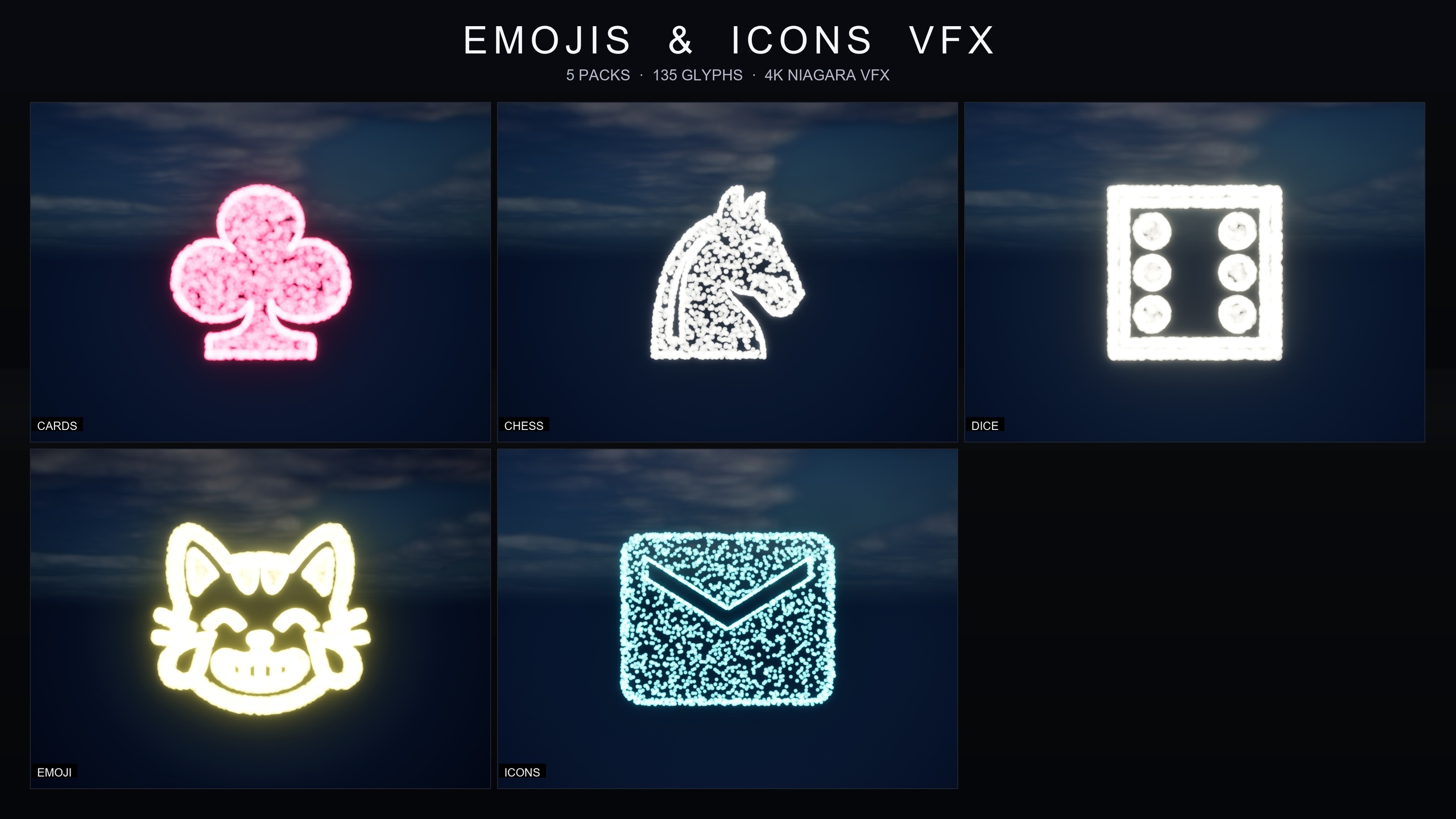
What ships, and why glyph-built icons suit a HUD
The bundle is content-only with zero third-party dependencies — no marketplace prerequisites, no extra plugins, no external content to chase. Everything lives under a single EmojisAndIconsVFX content folder, with the Niagara split into five themed packs: Card Suits, Chess Pieces, Dice Pips, Emoji and Material Design Icons. For UI work the Material Design Icons set is the one you want, because its 29 glyphs map directly onto the actions a HUD already exposes.
Because each icon is rendered from a baked glyph mesh and a font asset rather than a flat texture, it reads crisply at any scale — the listing describes it as 4K-ready and crisp at any scale. That matters for UI, where the same favorite or settings glyph might appear as a small HUD-corner accent in one layout and a large hero flourish in another. The systems use a CPU sprite renderer, which keeps them friendly across PC, console and mobile.
Out of the box the icons carry a signature cool cyan colour, and they sit happily under any post-process setup, playing nicely with bloom — which is what gives a particle glyph that clean glow against a dark HUD. If cyan is not your palette, you retune the whole pack from one asset, which is the subject of the styling step below.
Drop an icon effect into your scene
The fastest way to understand the pack is to play it. The bundle ships demo maps named L_Demo_EmojisAndIconsVFX_*, and because the icon set is large it is split across numbered part maps. Open one, hit play, and you will see each Material glyph rendered as particles so you can pick the actions you need.
1. Add the pack to your project, then in the Content Browser open Content/EmojisAndIconsVFX/Niagara and select the IconsMaterial subfolder. The Niagara systems are prefixed NS_IconsMaterial_ so you can filter them quickly.
2. Find the glyph that matches your action — for example a favorite icon for a 'liked' toast, a settings icon for an options confirmation, or an add icon for an inventory pickup.
3. Drag that NS_IconsMaterial_ system into the level, or attach it to an actor, and play. It runs immediately with no setup and no missing references — that is the whole point of a content-only pack.
4. To preview the full set before committing, open the matching L_Demo_EmojisAndIconsVFX_ icon map (remember the icon set spans numbered part maps) and scrub through the laid-out glyphs.
Triggering icon flair on button press, notification and save
World placement is fine for a HUD baked into a 3D scene — a holographic interface, a diegetic terminal, an in-world quest marker — but most UI flourishes need to fire on an event. The pattern is the same regardless of trigger: spawn the matching icon system at the right transform when the moment happens, then let its lifetime carry it out.
For a button press, drive it from the widget. In your button's clicked handler, call into a Blueprint actor or HUD-owned function that spawns the system. Use the 'Spawn System at Location' node when you want the effect at a world position, or 'Spawn System Attached' when it should ride a moving actor or socket. Feed it the NS_IconsMaterial_ system that matches the button's meaning — an add glyph for 'add to party', a search glyph for 'scan complete'.
For a notification or toast, spawn the relevant icon system as the toast appears so the glyph materialises out of particles alongside the message, then despawns as the toast fades. A favorite or a settings glyph reads instantly and reinforces what the notification is about without another word of text.
For a save-confirmation flourish, hook your save routine's success callback and spawn a single one-shot icon burst — a check-style or favorite glyph works well — at the HUD anchor you use for save state. Keep this one short and quiet; a save confirmation should reassure, not celebrate. For onboarding, the same approach drives an arrow glyph as a pointer that draws the eye to the next control.
Restyling the whole icon set from one asset
You will rarely want the default cool cyan for every game. Rather than editing 29 systems by hand, the pack gives you a single Niagara Parameter Collection, NPC_IconsMaterialStyle, that retunes the entire Material Design Icons set in real time.
Open NPC_IconsMaterialStyle and you can edit the controls the listing exposes across the whole pack at once: spawn rate, to move from a delicate dust of particles to a dense hero burst; particle size, to scale a glyph from a HUD-corner accent up to a screen-filling moment; glyph colour, to retheme every icon from one value so cyan becomes your brand colour; and lifetime, to choose between a one-shot pop and a persistent ambient glow.
Because all five packs in the bundle share this same architecture — one parameter collection per pack — learning to tune the icons teaches you to tune the emoji, card, chess and dice sets too. That consistency is what makes the bundle practical to live with rather than a one-off novelty.
Note that the exact default numeric values inside the parameter collection are not published in the listing, so treat your first open as a calibration pass: nudge spawn rate, size and lifetime against your own HUD and bloom settings rather than chasing specific figures.
Keeping it subtle with size and lifetime
The two dials that most decide whether UI flair feels premium or cheap are particle size and lifetime. For a HUD accent, keep size small enough that the glyph sits in its corner without crowding the readable interface, and keep lifetime short so a button-press flourish is a quick acknowledgement rather than a lingering distraction. Reserve large size and longer, persistent lifetimes for genuine hero moments — a level-complete or a major unlock — where a screen-filling glow is earned.
Lean on the renderer's strengths. The icons are designed to play nicely with bloom, so a modest glow from your post-process volume will do more for the look than cranking spawn rate. More particles is not more polish; a clean, well-bounded glyph that resolves clearly and then gets out of the way is what reads as quality.
Finally, build a small vocabulary and stick to it. Decide which glyph means save, which means notification, which means a positive confirmation, and reuse them consistently so players learn your HUD's language. With 29 Material icons to draw from, you have more than enough to cover a typical interface without inventing a new effect for every screen.
Matching Material icons to common HUD moments
| HUD moment | Suitable glyph | Spawn approach | Suggested lifetime |
|---|---|---|---|
| Button press / call-to-action | add, search or settings | Spawn System at Location on widget click | Short one-shot |
| Notification / toast | favorite or settings | Spawn as the toast appears | Short, fades with toast |
| Save confirmation | favorite (or a check-style glyph) | Spawn on save-success callback | Very short one-shot |
| Onboarding pointer | arrows | Spawn System Attached to the target control | Persistent until dismissed |
| Hero / unlock moment | favorite, home or settings | Spawn at HUD anchor, larger size | Longer / persistent glow |
Suggested mappings using glyphs that ship in the Material Design Icons pack (29 effects). Glyph names are from the product listing; the exact icon you pick is a design choice.
FAQ
How do I add a UI HUD button press notification particle effect in UE5?
Use a glyph-built Niagara icon from the Material Design Icons pack. In your widget's clicked handler, call a Blueprint function that uses 'Spawn System at Location' or 'Spawn System Attached' to spawn the matching NS_IconsMaterial_ system, then let its lifetime carry the flourish out. The pack is content-only, so the systems run with no extra setup.
How many icon effects are in the pack, and what do they cover?
The Material Design Icons pack contains 29 effects covering common HUD actions — home, menu, search, favorite, add, settings, camera and a set of arrows. It is one of five themed packs in the Emojis and Icons VFX Bundle, which holds 135 Niagara effects in total.
Can I change the icon colour to match my game?
Yes. The icons ship in a signature cool cyan, but you retune the entire pack from a single Niagara Parameter Collection, NPC_IconsMaterialStyle. From that one asset you can adjust glyph colour, spawn rate, particle size and lifetime across all 29 icons in real time.
Will these particle icons work on console and mobile?
The effects use a Niagara CPU sprite renderer, and the listing describes the bundle as PC, console and mobile-friendly. As with any VFX, test on your target hardware and keep particle size and spawn rate modest for UI flair rather than chasing dense bursts.
Do I need any plugins or other marketplace content to use it?
No. The bundle is content-only with zero third-party dependencies — no marketplace prerequisites, no extra plugins and no external content. You add it to your project, browse Content/EmojisAndIconsVFX/Niagara, and drag the systems you need into your scene or UI context.
Emojis and Icons VFX Bundle
Five themed Niagara packs in one bundle — Card Suits, Chess Pieces, Dice Pips, 80 Emoji and Material Design Icons — 135 effects in total. Each pack ships a Niagara Parameter Collection so spawn rate, size, colour and lifetime retune across a whole set from a single asset.