tutorial · 2026-05-28
Styling Axes, Grids, and Labels on a UE5 Chart Widget
A practical guide to Unreal Engine chart axis labels, grid customization, ticks and ranging with Fast Chart Widgets.
The problem: a chart that plots correctly but reads badly
Getting numbers onto a chart in Unreal Engine is the easy part. The hard part is making that chart legible at a glance inside a busy HUD or a dense stats screen — and that is almost entirely a question of how you style the axes, the grid and the labels. A line series sitting on a default frame with no axis titles, a grid that fights the data for attention, and tick labels that read 1200000 instead of 1.2M is technically correct and practically useless. This is where most Unreal Engine chart axis labels and grid customization work actually happens.
Fast Chart Widgets is a runtime data-visualisation plugin for UE5 that draws eight chart types — Line, Area, Scatter, Bar, Pie, Donut, Polar Area and Radar — entirely in Slate, with no per-project drawing code. Because the widget (UFastChartWidget) renders through Slate draw elements in its paint pass rather than relying on image assets, every visual element of the chart frame is data-driven and Blueprint-exposed. That means axis appearance, grid layers and label formatting are all properties you set, not textures you swap.
This tutorial walks through the four levers that control how a chart reads: per-axis settings, multiple grid layers, custom ticks with unit prefixes and suffixes, and the choice between fit-to-data and manual ranging. Everything here is exposed to both Blueprint and C++, so you can configure it once on a widget you place on the canvas, or bake it into a reusable template.
Axis settings: titles, colours, outlines and shadows
Each axis on a Fast Chart Widget is configured through a settings struct, FFastChartAxisSettings, which carries the axis title, its colour, line thickness, an outline, a drop shadow and alignment. Treat these as the typographic and structural decisions for the chart frame: the title tells the reader what the axis measures, while colour, thickness, outline and shadow decide how strongly that frame reads against whatever is behind it.
The outline and shadow fields matter more than they first appear, because charts in games rarely sit on a flat, controlled background. A HUD chart is often overlaid on moving game footage, and a thin single-colour axis line vanishes the moment the scene behind it shifts. Giving the axis an outline in a contrasting colour, or a soft shadow, keeps the frame readable over busy or unpredictable backdrops without resorting to an opaque panel behind the whole widget.
Use the axis title to do real work. On a frame-time graph, an axis titled simply 'ms' removes ambiguity that no amount of styling can fix; on a progression screen, 'Score' or 'Wave' on the X axis tells the player what they are looking at before they read a single number. Set the title text, then tune colour and thickness so the axis frame is present but quieter than the data series it surrounds — the series should always win the contrast battle.
Because the axis is styled in Slate rather than baked into an image, you can change any of these values at runtime in response to game state. There are no benchmark figures published for the rendering cost of these elements, so treat restyling as a normal property change and profile in your own project if you intend to animate axis appearance every frame.
Multiple grid layers
The grid is configured as an array, GridLayers, where each entry is an FFastChartGridSettings describing a step in X, a step in Y, a colour and a line thickness. The key idea is that this is a list, not a single grid: you can stack several layers on the same chart, each with its own spacing and styling. That is what lets you build the familiar major/minor grid look that makes a chart easy to read precisely without turning it into graph paper.
A common, effective pattern is two layers. The first is a fine minor grid with a small step and a very faint, low-contrast colour — close enough to the background that it gives the eye something to interpolate against but never competes with the data. The second is a coarse major grid with a larger step and a slightly stronger colour, drawn at the intervals you actually want the reader to count by. The result reads as structure rather than noise.
Keep grid colours quiet. The grid exists to support the data, so it should sit below the series and the axis frame in the visual hierarchy. If your grid is the first thing you notice, dial the colour back towards the background and reduce thickness. On charts overlaid on live gameplay, an over-bright grid is one of the fastest ways to make an otherwise clean chart look cluttered.
Because GridLayers is a plain array, adding, removing or restyling layers is just array manipulation — there is no fixed two-grid limit. Add a third layer if a particular chart genuinely benefits from it, but be disciplined: more grid lines rarely make a chart more readable past the major/minor pairing.
Custom ticks and unit prefix or suffix labels
Label formatting is handled by FFastChartLabelSettings, which exposes CustomTicks, a UnitPrefix, a UnitSuffix and MaxDecimals. Together these control where the labels sit on each axis and exactly how the numbers read — and they are the single biggest lever you have for making a chart feel finished rather than raw.
Use UnitPrefix and UnitSuffix to attach units directly to the tick labels instead of leaning on the axis title alone. A currency chart reads far better with a prefix so values show as a money figure, and a frame-time chart benefits from a suffix so values read as milliseconds. Pair that with MaxDecimals to stop noisy fractional digits: a frames-per-second axis almost never needs decimals, while a normalised 0–1 metric might want one or two. Setting MaxDecimals deliberately is what turns 16.66667 into a clean 17.
CustomTicks gives you control over where labels appear rather than relying solely on automatic spacing. This is invaluable when the meaningful values on an axis are not evenly spaced or when you want to call out specific thresholds — a target frame budget, a price band, a round-number milestone — by placing a tick exactly there. Define the ticks you care about and the chart labels those positions instead of guessing at an even division.
Think of label settings and grid steps as a pair. The grid tells the eye where the gridlines fall; the ticks and their formatting tell the reader what those positions mean. When the major grid step and the tick positions line up, the chart reads as a single coherent scale; when they drift apart, it reads as two competing systems. Set them together, not in isolation.
Fit-to-data versus manual ranges
How an axis chooses its minimum and maximum is the last big readability decision, and Fast Chart Widgets gives you both modes per axis. Call SetFitToDataY (and SetFitToDataX) to let the chart size the axis automatically to whatever data is currently loaded, or SetManualYRange (and SetManualXRange) to pin the axis to a fixed minimum and maximum you choose.
Fit-to-data is the right default for exploratory or unbounded series where you do not know the scale in advance — plotting arbitrary incoming values, prototyping, or showing a metric whose range varies wildly between sessions. The chart always frames the data tightly so nothing falls off the edge and small variations stay visible. The trade-off is that the axis scale moves as the data moves, which can be distracting on a live overlay where the gridlines appear to breathe.
Manual ranging is the right call whenever the meaningful scale is fixed and known. A frame-budget chart should be pinned so the same 60 fps line always sits at the same height regardless of the current reading — that stability is the whole point of a budget chart. Percentages, normalised values and any metric with a hard ceiling all read better on a manual range, because the reader learns the scale once and trusts it thereafter.
A practical concern with fit-to-data is violent auto-zoom: when a series is nearly flat, automatic ranging can magnify tiny noise into huge swings because it fits the axis to a vanishingly small span. Fast Chart Widgets addresses this with MinAutoRangeSpan, a floor on how small the auto-ranged span is allowed to get, which stops the axis from snapping in hard on near-constant data. If your fit-to-data charts feel jumpy on quiet stretches, raise that floor before you reach for a manual range.
Putting it together: a styled frame-time chart in Blueprint
Here is a concrete sequence that combines all four levers into a single readable chart. The same calls are available in C++ if you prefer to drive everything from code.
1. Place a 'UFastChartWidget' on your UMG canvas, then in the Event Graph build a chart through the builder API — call 'CreateChartBuilder' and then 'CreateLineChart' for a time-series like frame time.
2. Create a series with the series API and push your data: use 'AddDataPoint' with an X and Y for incremental points, or 'AddBulkDataPointsXY' when you already have an array of samples.
3. Set the Y axis range explicitly with 'SetManualYRange' so your frame-budget reference sits at a stable height; leave the X axis on 'SetFitToDataX' if it scrolls with incoming samples, or pin it with 'SetManualXRange' for a fixed window.
4. Configure the axis appearance through the axis settings: give the Y axis a title of 'ms', pick a colour and thickness that sits behind the series, and add an outline or shadow so the frame survives over live gameplay.
5. Add two grid layers via 'GridLayers' — a faint fine layer for interpolation and a stronger coarse layer at the interval you want the player to count by — keeping both quieter than the data.
6. Finish with the label settings: set 'UnitSuffix' so values read in milliseconds, set 'MaxDecimals' to zero or one to kill noisy digits, and use 'CustomTicks' to mark your target budget line precisely.
If you would rather not assemble this by hand, Fast Chart Widgets ships 34 pre-configured chart templates across six marketplace categories, reachable from a 'Chart Template Marketplace' button the editor adds to the Widget Blueprint toolbar. Drop a pre-styled chart in with one click, then adjust only the axis, grid and label properties you want to change — the styling levers in this tutorial are exactly the ones exposed on those templates.
Where styled charts fit in a wider toolchain
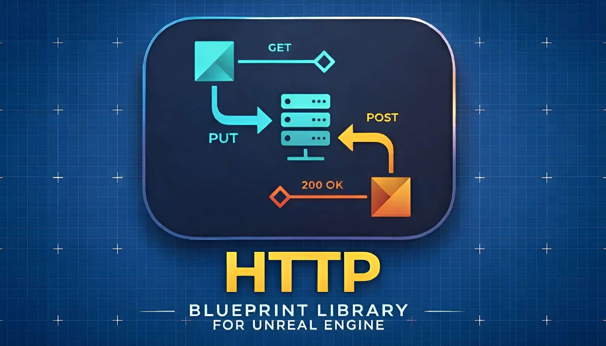
A well-styled chart is only as useful as the data behind it, and in real projects that data often comes from somewhere else. If you are charting live values pulled from a backend — leaderboard history, remote config, telemetry returned by an API — EasyHTTP gives you Blueprint-friendly GET and POST nodes to fetch JSON without boilerplate, which you can parse and feed straight into a series with 'AddBulkDataPointsXY'. It is a Win64-only runtime plugin for UE 5.5–5.7, so confirm that matches your target before you wire it in.
For documenting the chart configurations your team standardises on — which template maps to which screen, what each axis means, how the ranges are chosen — Markdown 4 Blueprints lets you keep WYSIWYG notes attached to the relevant Blueprint inside the editor. Note that it is an editor-only documentation tool that writes .md files into your project; it does not render Markdown into in-game UI, so reach for it to document your charts, not to draw them.
And if your project surfaces longer-form reference material in-world — a manual, a spec sheet, an exported report — Simple PDF Viewer rasterises PDF pages to textures and shows them on in-world meshes, which pairs naturally with a stats or dashboard scene. All three are Windows-only UE 5.5–5.7 plugins from the same toolset, so they slot together cleanly alongside Fast Chart Widgets.
The four styling levers and what they control
| Lever | Controlled by | What it sets |
|---|---|---|
| Axis appearance | FFastChartAxisSettings | Title, colour, thickness, outline, shadow, alignment |
| Grid | GridLayers (array of FFastChartGridSettings) | Step X / step Y, colour, thickness per layer |
| Labels | FFastChartLabelSettings | CustomTicks, UnitPrefix, UnitSuffix, MaxDecimals |
| Ranging | SetManualYRange / SetFitToDataY (and X equivalents) | Manual min/max versus automatic fit-to-data, with MinAutoRangeSpan floor |
Each lever maps to a specific Fast Chart Widgets struct or function exposed to Blueprint and C++.
Fit-to-data versus manual ranging
| Mode | Best for | Trade-off |
|---|---|---|
| Fit-to-data (SetFitToDataY / SetFitToDataX) | Unbounded or exploratory series where the scale is unknown in advance | Axis scale moves with the data; can look jumpy on near-flat data unless MinAutoRangeSpan is raised |
| Manual range (SetManualYRange / SetManualXRange) | Fixed, known scales: budgets, percentages, normalised values | Out-of-range values can clip; you must know the scale up front |
Choose per axis based on whether the meaningful scale is fixed or unknown.
FAQ
How do I customise the axis labels and grid on an Unreal Engine chart?
On a Fast Chart Widgets chart you style each axis through the FFastChartAxisSettings struct (title, colour, thickness, outline, shadow, alignment), control the grid through the GridLayers array of FFastChartGridSettings (step X/Y, colour, thickness per layer), and format the labels through FFastChartLabelSettings (CustomTicks, UnitPrefix, UnitSuffix, MaxDecimals). All of these are exposed to Blueprint and C++, so you set them as properties rather than editing any image asset.
Can I show units like ms or a currency symbol on the axis tick labels?
Yes. FFastChartLabelSettings provides UnitPrefix and UnitSuffix so you can attach a unit directly to the tick numbers — a prefix for currency, a suffix for milliseconds — and MaxDecimals to control how many fractional digits appear so the labels stay clean.
How do I stop my chart from zooming in violently when the data is almost flat?
That is what MinAutoRangeSpan is for. When you use fit-to-data ranging, it sets a floor on how small the auto-ranged span can become, which stops the axis from magnifying tiny noise on near-constant data. Raise it if your fit-to-data charts feel jumpy, or switch that axis to a manual range with SetManualYRange when the scale is fixed and known.
Can I have both a fine minor grid and a coarse major grid on the same chart?
Yes. GridLayers is an array, so you can stack multiple FFastChartGridSettings entries on one chart — typically a faint fine layer with a small step and a stronger coarse layer at the interval you want readers to count by. Keep both quieter than the data series so the grid supports the chart rather than competing with it.
Which Unreal Engine versions and platforms does Fast Chart Widgets support?
Fast Chart Widgets targets Unreal Engine 5.5, 5.6 and 5.7 and is Windows 64-bit only. It ships two modules — a runtime FastChartWidgets module and an editor module that adds the Chart Template Marketplace button to the Widget Blueprint toolbar.
Fast Chart Widgets
Line, bar and pie widgets that bind straight to your data — no custom drawing code. Build dashboards, stats screens and debug overlays in minutes.