tutorial · 2026-06-23
Build Interactive Charts in UE5 with Visual Chart Designer Pro
A grounded walkthrough: design a chart as an asset in the five-region live-preview editor, feed it real data, theme it, and one-click Open in UMG — across all eight chart families.
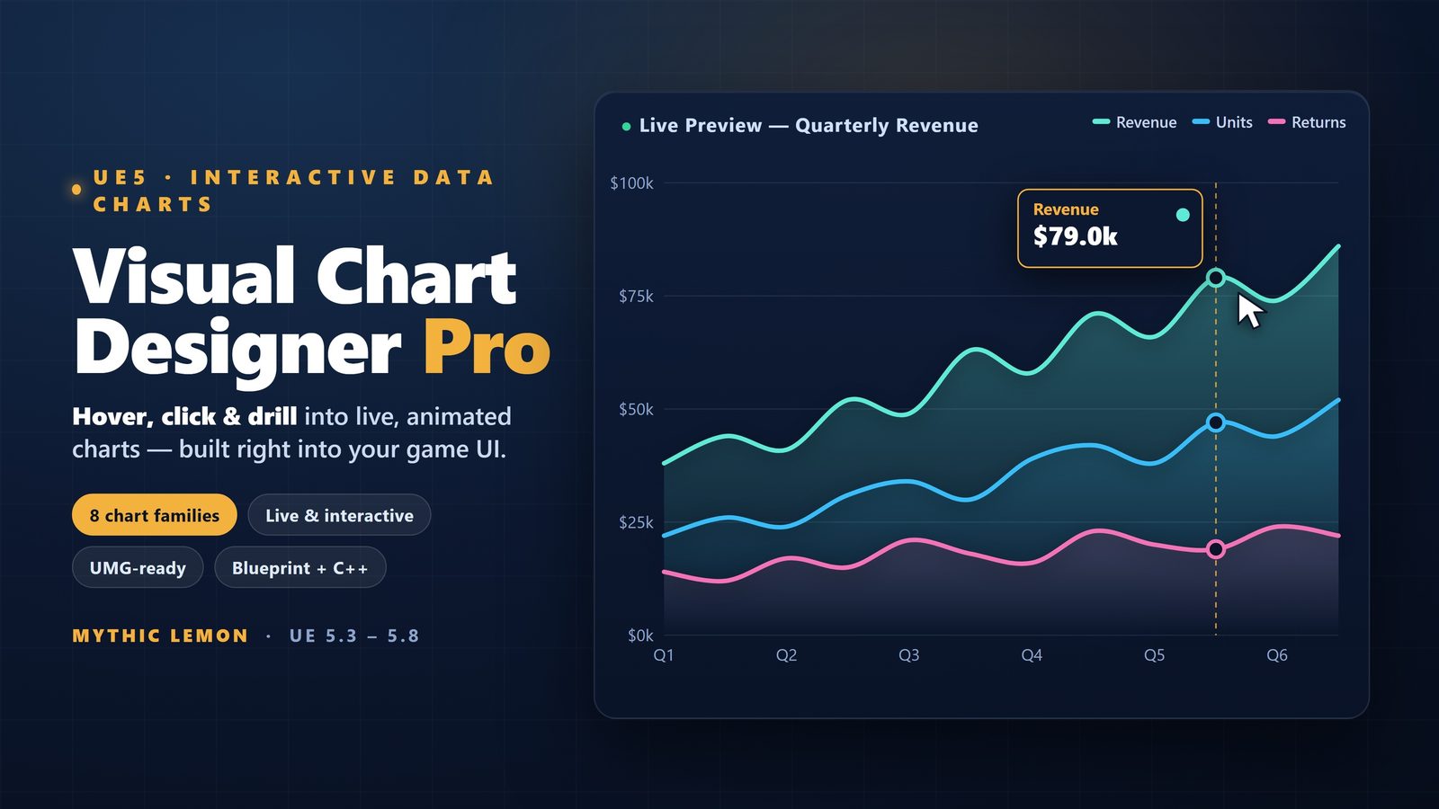
The idea: a chart is an asset, not throwaway draw code
Most teams reach for charts late and reach for them badly. You need a stats screen, a debug overlay, an economy dashboard or a results readout, so you start hand-drawing lines and bars onto a canvas, hard-coding colours and data references into a single widget, and rebuilding the whole thing the next time a designer wants a different look. It works for one chart and falls apart at three.
Visual Chart Designer Pro takes the opposite approach: you author the chart as a first-class asset and tune it in a dedicated editor before it ever touches your UI. The chart is a ChartDocument data asset — the plugin ships nine of them as examples — so it lives in your Content Browser like a material or a Blueprint, can be version-controlled, duplicated and shared, and is decoupled from the screen it eventually appears on.
That separation is the whole point of this tutorial. You will design and theme the chart in one place, against representative data, with a live preview in front of you. Only when it looks right do you push it into UMG. The design you settle on in the editor is the design that ships, because Open in UMG re-skins the bound widgets to match. This guide walks the full path: open the editor, learn the five regions, feed a data source, pick a chart family, theme it, and ship it to a widget.
The five-region live-preview editor
Double-click a ChartDocument and you land in a purpose-built asset editor with five regions, each doing one job. Knowing what each region is for is most of the learning curve, so it is worth a slow first pass.
Preview is the large central canvas. It renders the chart as it currently stands and updates live as you change anything — swap the data, change a colour, switch chart family and the preview reflects it immediately. This is the feedback loop that makes the tool quick to work in: you are never guessing what a change will look like, because you are looking at it.
Outliner is the structural view of the chart — its series, axes and the elements that make it up. You select things here to act on them, the same way the World Outliner lets you pick actors in a level. Details is the inspector for whatever you have selected: the properties you edit to shape the chart live here, and editing them is what drives the live preview.
Simulation is the region that sets this editor apart from a static preview. It lets you exercise the chart with changing values so you can see how it behaves with live, moving data rather than a single frozen snapshot — useful when the chart will be fed by gameplay numbers at runtime. Toolbar runs across the top with the document-level actions, including the Open in UMG button you will use at the end. Spend a few minutes selecting elements in the Outliner and watching the Details panel and Preview respond; once that loop is familiar, everything else is fast.
Feeding it data: built-in sources, then CSV, JSON or DataTable
A chart is only as good as the data behind it, and the editor is built so you can make the visuals right before your real data exists. There are 29 built-in data sources to design against. Pick one that resembles the shape of your eventual data — a time series, a set of categories, a distribution — and theme the chart while watching the live preview. This means a designer can finish the look of an economy graph or a survey radar long before the gameplay systems that will feed it are wired up.
When you are ready for your own numbers, the plugin imports from three formats. CSV is the path of least resistance for anything that started life in a spreadsheet or came out of an analytics export: rows and columns map cleanly onto categories and series. JSON suits data that already exists in a structured form — a results payload, a config file, a small dataset you generate from code. DataTable is the native Unreal route, and often the best one for shipped games: keep your chart's data as DataTable rows alongside the rest of your game data, and the chart reads straight from it.
A practical workflow that keeps you productive: prototype the design against a built-in source whose shape matches your target, lock in the chart family and theme, then swap to your CSV, JSON or DataTable import once the real data lands. Because the visual design is held in the ChartDocument and the data source is a separate concern, changing the data underneath does not unpick the styling you spent time on.
If your data lives in a DataTable, prefer that import for a shipped product. It keeps a single source of truth inside the project, it cooks and version-controls like the rest of your content, and it avoids shipping loose CSV or JSON files that have to be located and parsed at runtime.
The eight chart families and when to reach for each
Visual Chart Designer Pro ships eight chart families, and choosing the right one is a design decision more than a technical one. The same ChartDocument and the same data can often be expressed several ways, and the live preview makes it cheap to try them. Here is how the eight tend to map onto game and tool UI.
Line is for a value changing over a continuous axis — health or resource history, a frame-time trace, an economy figure over a campaign. Area is a Line with the region beneath it filled, which reads as accumulation or magnitude over time and stacks well when you want to show how parts add up to a whole. Scatter plots individual points against two axes, which is the right tool for distributions and correlations — think balancing data, telemetry clusters or a per-entity readout where each dot is one thing.
Bar is the workhorse for comparing discrete categories — items, factions, levels, options — and is usually the safest default when you simply need to compare a handful of named values. Pie and Donut both show parts of a whole as proportions of a circle; reach for them when the share matters more than the absolute number, and prefer them only for a small number of slices where the proportions are genuinely meant to be compared at a glance. The Donut's open centre is handy when you want to place a total or a label inside the ring.
PolarArea and Radar are the two circular families that newcomers reach for least and benefit from most. PolarArea maps categories around a circle with the value driving each segment's radius, which suits cyclical or directional data. Radar plots several axes from a common centre and is the classic choice for multi-attribute comparisons — a character's stats, a weapon's profile, a faction's strengths — where you want the overall shape, not just individual numbers, to communicate. Because switching family is a live operation in the editor, the honest advice is to try two or three on your actual data and keep the one that reads clearest.
Theming: seven palettes, colour-blind-safe by default if you want it
A chart that is hard to read is worse than no chart, and colour is where most homemade charts fall down. Visual Chart Designer Pro ships seven themes plus a curated palette library, so theming is a matter of selection rather than picking hex codes by hand.
Two of the seven deserve a specific mention because they are chosen for legibility rather than fashion. Okabe-Ito is a palette designed so its colours stay distinguishable for viewers with the common forms of colour-vision deficiency — a genuinely accessible default for any chart a player has to read. Viridis is a perceptually uniform palette, meaning equal steps in your data map to equal-looking steps in colour, which avoids the misleading bright bands you get from naive rainbow colour maps. If your chart encodes a continuous value, Viridis is usually the more honest choice; if it encodes a handful of categories that must never be confused, Okabe-Ito is the safer one.
Apply a theme, watch the preview update, and lean on the curated palette library when a built-in theme is close but not quite on-brand. Theming here is reversible and non-destructive — it is held in the ChartDocument alongside the rest of the design — so you can audition palettes freely without committing to any of them. Settle the look here, in the editor, because this is the styling that the next step carries into your live UI.
One-click Open in UMG — plus the honest limits of v1.0
This is the step that closes the loop and the reason to design in the asset editor rather than directly in a widget. When the chart looks right, press Open in UMG from the toolbar. The chart you designed is brought into UMG and the bound widgets are live re-skinned to match it, so the colours, family and styling you settled on in the preview are the colours, family and styling that appear in your HUD, menu or dashboard. There is no separate hand-off where a developer rebuilds the designer's chart by eye and the two drift apart. To get you going, the plugin ships four Widget Blueprints alongside the nine example ChartDocument assets and four demo maps — open the demo maps to see charts running in context, and start from the Widget Blueprints rather than building the binding plumbing yourself.
Under the bonnet the plugin is split into three modules, which is worth knowing for what ships in your game versus what stays in the editor. VisualChartDesigner is the Runtime module — the part that renders your charts in a packaged build. VisualChartDesignerEditor is the Editor module that provides the five-region designer itself. VCDPFeedback is a separate Editor module for the optional Send Feedback panel. Across the plugin there are 52 UObject classes exposing 96 reflected types, so the chart objects, data and styling are available to Blueprint and C++ where you need to drive them at runtime — the same data path you previewed with the Simulation region, which exists precisely so you can be confident about live behaviour before you ship it.
Two features touch the network, and both are off or silent until you choose otherwise. The AI styling assistant is optional and OFF by default; it only does anything when you opt in and supply your own OpenAI or Anthropic key, and only then, and only when you use it, does it send your typed prompt plus the current chart styling over HTTPS to that provider. If you never opt in, nothing about your chart leaves your machine through it. The Send Feedback panel is likewise opt-in per use: it transmits only the text you type, plus the editor log if — and only if — you choose to attach it.
Now the limits, because grounded tooling means stating them plainly. This is v1.0 and Windows (Win64) only — there is no macOS editor support in this release, so a Mac-based artist cannot run the designer yet. The supported engine range is Unreal Engine 5.3 to 5.8. The plugin is not network replicated, which is the expected design for editor-time authoring and runtime UI. It ships a User Guide as the canonical reference. Choose this designer when the chart itself is something you want to author, theme and iterate on as a version-controlled asset — with all eight families, importable CSV, JSON or DataTable data, and colour-blind-safe theming — rather than hand-drawing each chart into a single widget.
The eight chart families and what they are for
| Family | Best for | Typical game / tool use |
|---|---|---|
| Line | A value over a continuous axis | Health/resource history, frame-time trace, economy over a campaign |
| Area | Magnitude or accumulation over time | Stacked totals, cumulative figures |
| Scatter | Distributions and correlations | Balancing data, telemetry clusters, per-entity readouts |
| Bar | Comparing discrete categories | Items, factions, levels, options — the safe default |
| Pie | Parts of a whole, few slices | Share of a total where proportion matters |
| Donut | Parts of a whole with a centre label | Proportions with a total in the open middle |
| PolarArea | Cyclical or directional categories | Value driving each segment's radius around a circle |
| Radar | Multi-attribute comparison | Character stats, weapon profiles, faction strengths |
All eight ship in Visual Chart Designer Pro. Switching family is a live operation in the editor, so trying two or three against your own data is cheap.
The five editor regions
| Region | What it does |
|---|---|
| Preview | Central canvas that renders the chart and updates live on every change |
| Outliner | Structural view of the chart's series, axes and elements to select and act on |
| Details | Inspector for the selected element — the properties you edit drive the preview |
| Simulation | Exercises the chart with changing values to test live, moving data |
| Toolbar | Document-level actions, including the one-click Open in UMG button |
Each region does one job; the Preview updates live as you edit anything in the others.
FAQ
How do I build an interactive chart in UE5 with Visual Chart Designer Pro?
Author the chart as a ChartDocument asset and open it in the five-region live-preview editor (preview, outliner, details, simulation and toolbar). Pick one of the eight chart families, feed it a data source — one of the 29 built-in sources, or your own CSV, JSON or DataTable import — theme it with one of the seven palettes, and watch the preview update live as you tune it. When it looks right, press Open in UMG from the toolbar to bring the design into a widget.
What data can it read?
There are 29 built-in data sources to design against, plus import from CSV, JSON or a DataTable. A common workflow is to prototype the look against a built-in source whose shape matches your eventual data, then swap to your own import once the real numbers land. For a shipped game, the DataTable route keeps a single source of truth inside the project.
What does Open in UMG actually do?
It takes the chart you designed in the editor and brings it into UMG, live re-skinning the bound widgets to match. The colours, chart family and styling you settled on in the preview are the ones that appear in your HUD or dashboard, so there is no separate hand-off where the chart gets rebuilt by eye and drifts from the design. The plugin ships four Widget Blueprints to start from.
Does the AI styling assistant send my data anywhere?
Only if you choose to use it. The AI styling assistant is off by default. It does nothing until you opt in and supply your own OpenAI or Anthropic key; only then, and only when you use it, does it send your typed prompt plus the current chart styling over HTTPS to that provider. The separate Send Feedback panel transmits only the text you type, plus the editor log if you explicitly attach it.
What are the platform and engine limits?
This is v1.0 and Windows (Win64) only — there is no macOS editor support in this release. The supported engine range is Unreal Engine 5.3 to 5.8. The plugin is not network replicated, which is the expected design for editor-time authoring and runtime UI. It ships a User Guide as the canonical reference.
Visual Chart Designer Pro
Design charts visually in a five-region live-preview asset editor — preview, outliner, details, simulation and toolbar — then open the result straight in UMG with a one-click re-skin of bound widgets. Eight chart families (Line, Area, Scatter, Bar, Pie, Donut, PolarArea, Radar), 29 built-in data sources plus CSV / JSON / DataTable import, and seven themes including the colour-blind-safe Okabe-Ito and Viridis palettes. An optional AI styling assistant is off by default.
Related reading