tutorial · 2026-06-21
UE5 Radar & PolarArea Charts for Stat Screens (VCD Pro)
A focused tutorial on designing Radar and PolarArea charts for character stat screens, comparison dashboards and HUDs in UE5 with Visual Chart Designer Pro, then taking them straight to UMG.
Why Radar and PolarArea suit stat screens
Two of the most common pieces of game UI are also two of the trickiest to draw by hand: the character stat web you see on an RPG sheet, and the radial breakdown that turns a handful of numbers into a shape you can read at a glance. A Radar chart plots several axes from a shared centre, so a character's strength, agility, intellect, vitality and luck become a single silhouette you can compare against another build. A PolarArea chart keeps every wedge at the same angular width but lets the radius carry the value, which makes it a clean fit for a HUD ring, a resource breakdown, or a damage-by-type readout.
This tutorial focuses on those two chart families and the workflow around them in Visual Chart Designer Pro, a UE5 editor plugin. The plugin ships eight chart families in total (Line, Area, Scatter, Bar, Pie, Donut, PolarArea and Radar); we are deliberately staying inside the two that matter for stat screens, comparison panels and HUDs. The general approach, design the chart as an asset, watch it update live, theme it, then open it in UMG, applies to all eight, but Radar and PolarArea are where it earns its place fastest because they are the families most people give up on drawing manually.
Everything below assumes you are on Windows and on a supported engine version. Visual Chart Designer Pro targets Unreal Engine 5.3 through 5.8 and, in version 1.0, ships for Windows (Win64) only, with no macOS build. If you are on a Mac, this workflow is not available to you yet, and it is worth being clear about that before you start rather than after.
The live-preview asset editor, in five regions
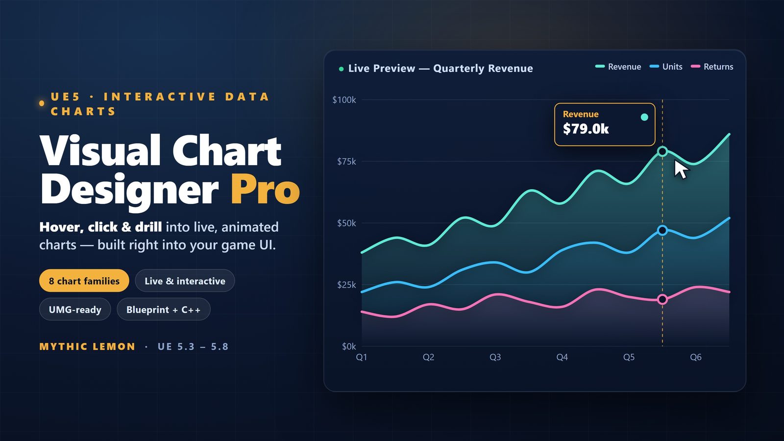
Visual Chart Designer Pro is built around a five-region asset editor: a preview, an outliner, a details panel, a simulation panel and a toolbar. The important idea is that a chart is an asset you author, not a widget you assemble blind. You create a ChartDocument, pick a family, point it at data, and the preview redraws as you go, so the feedback loop is immediate rather than compile-and-check.
The outliner is where the structure of the chart lives: the series, the axes and the elements that make up the drawing. Select something there and the details panel exposes its properties, which is where the bulk of your authoring happens. The simulation region is what makes a stat screen feel real before it is wired to anything: you can push values through the chart and watch the Radar silhouette or the PolarArea wedges respond, which is exactly the behaviour you want to confirm looks right at minimum and maximum stats. The toolbar gathers the actions, including the Open in UMG step we come to later.
For learning the tool, the plugin ships nine ChartDocument data assets, four Widget Blueprints and four demo maps. Opening one of the supplied ChartDocuments that already uses a Radar or PolarArea layout is the quickest way to see a working example before you build your own from scratch. A User Guide is included as well, which is the canonical reference if a panel or property here does not behave the way you expect.
Building a character stat Radar
Start by creating a new ChartDocument and choosing the Radar family. A Radar chart needs one axis per stat, so decide your axis set first: for a classic RPG sheet that might be strength, agility, intellect, vitality and luck. Each axis runs from the shared centre outward to a maximum, and the value on each axis is a point; joined together, the points form the silhouette that players read as a build. Keep the axis count honest, five to seven axes stay legible, while a dozen tightly packed axes turn into noise.
For data, you have two routes. The plugin includes 29 built-in data sources, which are ideal while you are designing and want representative numbers in front of you immediately. When you are ready to drive the chart from your own content, you can import from CSV, JSON or a DataTable, and a DataTable is usually the most natural fit for game stats because your character data very likely already lives in one. Author the chart against sample values first, confirm the shape reads well at the extremes using the simulation panel, then swap in your real source.
To support a comparison dashboard, plot a second series on the same axes, for example the player's current build against a recommended one, or two party members side by side. The strength of Radar here is precisely that overlap: two silhouettes on shared axes make relative strengths and weaknesses obvious in a way a table of numbers never does. Tune fill opacity and stroke in the details panel so the front series stays readable over the one behind it, and lean on the live preview to judge that rather than guessing.
Building a PolarArea HUD readout
Create a second ChartDocument and choose the PolarArea family. Unlike a Pie or Donut, where the angle encodes the value, a PolarArea chart fixes each segment to the same angle and varies the radius, so longer wedges mean larger values. That property makes it a good radial readout for a HUD: damage taken by type, resource composition, or a set of resistances where you want each category to occupy a consistent slice of the ring and only the length to change.
Bind it to data the same way as the Radar: prototype with one of the 29 built-in sources, then import your real numbers from CSV, JSON or a DataTable when the design is settled. Because PolarArea wedges are read by length, order your categories deliberately, grouping related types adjacent to one another so the eye can compare neighbouring wedges. Use the simulation panel to drive a category to zero and to its maximum and confirm the chart still reads cleanly at both ends; a HUD element that looks fine at mid-range but breaks at the extremes is a common trap.
If you are torn between PolarArea and a Donut for a given panel, the deciding question is what you want the player to read. If the story is share of a whole, a Donut is the more conventional choice; if the story is the relative magnitude of several fixed categories, PolarArea's equal angles and variable radius make the comparison more direct. Both families are in the box, so you can build one of each and judge them in the preview rather than committing on paper.
Theming, and why colour-blind-safe matters
A stat screen lives or dies on legibility, and colour is the first thing to get right. Visual Chart Designer Pro ships seven themes, and two of them are chosen specifically for accessibility: Okabe-Ito and Viridis. The Okabe-Ito palette is a well-established qualitative set designed so its colours remain distinguishable for the most common forms of colour-vision deficiency, which makes it a sensible default for a Radar comparing two series, where the whole point is telling the silhouettes apart. Viridis is a perceptually uniform sequence that is also robust under colour-blind viewing, which suits a PolarArea readout where wedges sit on a graded scale.
Colour-vision deficiency affects a meaningful share of the population, so a two-series Radar that relies on a red-versus-green contrast will fail some of your players. Reaching for Okabe-Ito or Viridis from the start is cheaper than discovering the problem in a play-test. On top of the seven themes, the plugin includes a curated palette library, so you can pick a set that matches your game's art direction without hand-mixing colours and accidentally landing on a combination that does not separate.
Theming is not only colour. The details panel is where you adjust the per-element styling that makes a chart feel like part of your game rather than a default widget, and because the preview updates live, theming is a matter of selecting an element, changing a value, and reading the result immediately. Settle the theme before you take the chart to UMG so that what you send across is already the look you intend to ship.
Open in UMG, plus optional AI styling on your terms
Once the Radar or PolarArea chart reads the way you want, the toolbar's one-click Open in UMG step takes it into a UMG widget and live re-skins the bound widgets, so the design you built in the asset editor becomes the widget you place in your HUD or dashboard. This removes the usual disconnect, where a chart looks right in a design tool but has to be rebuilt by hand in the engine UI and drifts in the process. Here the document and the widget are the same design, so you iterate where iteration is cheap, the live-preview editor, and only move to UMG when the chart is finished. For a comparison dashboard hosting several charts, build each as its own ChartDocument, get each right in isolation, then bring them into the UMG layout together.
A few honest boundaries are worth stating. The plugin is not network replicated, so if you are showing stats in a multiplayer context you are responsible for getting the underlying values to each client; the chart draws what it is given. And the whole tool is Windows-only in version 1.0 across UE 5.3 to 5.8, so plan your team's platforms accordingly. Within those bounds, the Radar-and-PolarArea-to-UMG path is a fast, legible way to ship the stat screens and HUD readouts that are otherwise a chore to draw.
On AI, the default is the conservative one. Visual Chart Designer Pro includes an optional AI styling assistant that is off unless you turn it on, and only when you opt in with your own OpenAI or Anthropic key does it send your typed prompt and the current chart styling over HTTPS to suggest styling changes. There is also an optional Send Feedback panel, handled by the plugin's VCDPFeedback editor module, which transmits only the text you type plus the editor log if you choose to attach it. Neither feature is a precondition for any of the work above: you can design Radar and PolarArea charts, theme them with Okabe-Ito or Viridis, and open them in UMG entirely locally, with no cloud dependency at all.
Radar vs PolarArea for UE5 stat UI
| Aspect | Radar | PolarArea |
|---|---|---|
| What it encodes | Several axes from a shared centre; value is a point per axis | Equal-angle wedges; value is the radius (length) of each wedge |
| Best for | Character stat webs and two-build comparisons | HUD ring readouts: damage-by-type, resources, resistances |
| Reads best with | 5-7 axes; more than that turns to noise | A modest set of categories, grouped by relation |
| Comparison | Overlay a second series for build-vs-build | Compare neighbouring wedge lengths |
| Accessibility pick | Okabe-Ito to keep two series distinct | Viridis for a graded, colour-blind-safe scale |
Both families ship in Visual Chart Designer Pro. Guidance is general charting practice; the family list and themes are from the product's feature set.
What the workflow needs
| Item | Detail |
|---|---|
| Engine | Unreal Engine 5.3 - 5.8 |
| Platform | Windows (Win64) only, v1.0 |
| Editor | Five-region live-preview asset editor |
| Chart families | 8 total; this tutorial uses Radar and PolarArea |
| Data | 29 built-in sources, plus CSV / JSON / DataTable import |
| Themes | 7, including colour-blind-safe Okabe-Ito and Viridis |
| To UMG | One-click Open in UMG with live re-skin of bound widgets |
From the Fab technical details for Visual Chart Designer Pro. Windows-only in v1.0; not network replicated.
FAQ
Which chart should I use for a character stat screen in UE5?
For a multi-stat character sheet, a Radar chart is the natural choice: it plots one axis per stat from a shared centre and joins the values into a silhouette you can read at a glance, and you can overlay a second series to compare two builds. If you instead want a radial HUD readout where each category keeps a fixed slice and only its length changes, a PolarArea chart fits better. Both families ship in Visual Chart Designer Pro.
What is the difference between PolarArea and a Pie or Donut chart?
In a Pie or Donut chart the angle of each slice encodes its value. In a PolarArea chart every wedge has the same angular width and the radius carries the value, so longer wedges mean larger values. That makes PolarArea a good fit when you want each category to occupy a consistent slice of a HUD ring and read the comparison by length rather than by angle.
Are the charts accessible for colour-blind players?
They can be. Visual Chart Designer Pro ships seven themes, two of which are chosen for accessibility: the Okabe-Ito qualitative palette, designed to stay distinguishable under common colour-vision deficiencies, and Viridis, a perceptually uniform sequence that is also colour-blind-safe. Using one of these from the start is the simplest way to keep a two-series Radar or a graded PolarArea legible for all players.
Do I have to rebuild the chart by hand in UMG?
No. You design the chart as a ChartDocument asset in the live-preview editor, and a one-click Open in UMG step takes it into a UMG widget and live re-skins the bound widgets. The design you finished in the asset editor becomes the widget you place in your HUD or dashboard, so there is no separate hand-rebuild that could drift from your intended look.
Does Visual Chart Designer Pro run on macOS, and is it multiplayer-ready?
Version 1.0 is Windows (Win64) only, with no macOS build, and it targets Unreal Engine 5.3 to 5.8. The plugin is not network replicated, so in a multiplayer game you are responsible for delivering the stat values to each client; the chart simply draws what it is given. Plan your platforms and replication accordingly before adopting it.
Visual Chart Designer Pro
Design charts visually in a five-region live-preview asset editor — preview, outliner, details, simulation and toolbar — then open the result straight in UMG with a one-click re-skin of bound widgets. Eight chart families (Line, Area, Scatter, Bar, Pie, Donut, PolarArea, Radar), 29 built-in data sources plus CSV / JSON / DataTable import, and seven themes including the colour-blind-safe Okabe-Ito and Viridis palettes. An optional AI styling assistant is off by default.
Related reading